
"You'll never soar like an eagle if you hang out with turkeys"
-Overheard from the streets of Bay Ridge
Role: User Research, UI, Information Architecture, Visual design
Industry: Finance
Duration: 2 weeks
Role: User Research, UI, Information Architecture, Visual design
Industry: Finance
Duration: 2 weeks
Role: User Research, UI, Information Architecture, Visual design
Industry: Finance
Duration: 2 weeks
Role: User Research, UI, Information Architecture, Visual design
Industry: Finance
Duration: 2 weeks

Role: User Research, UI, Information Architecture, Visual design
Industry: Finance
Duration: 2 weeks
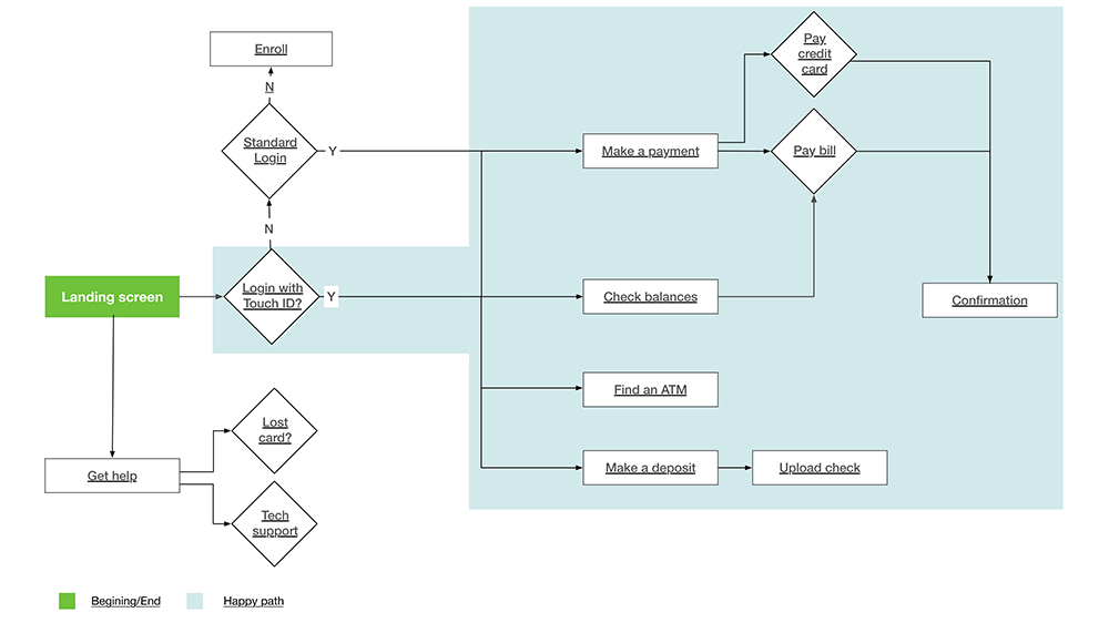
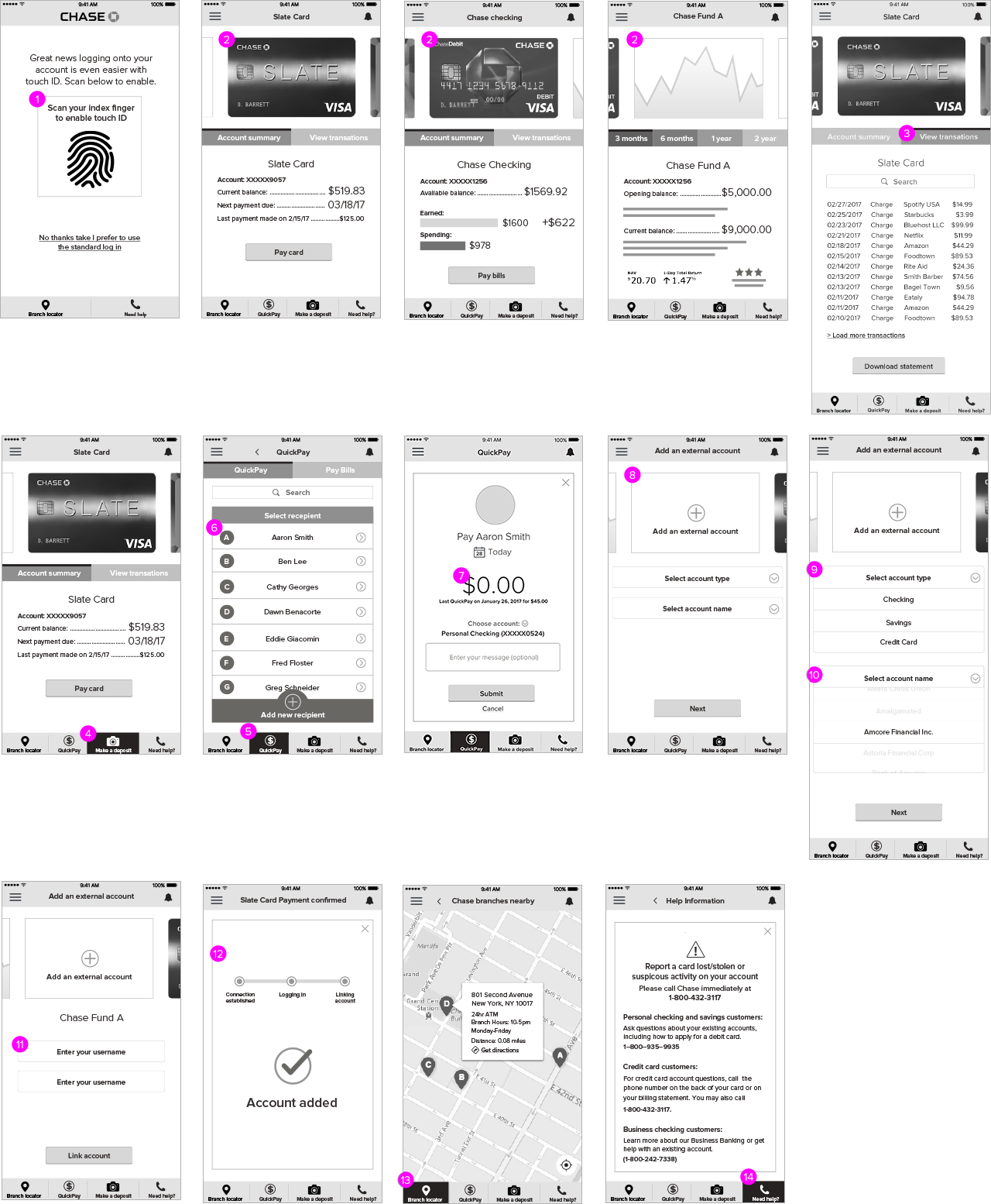
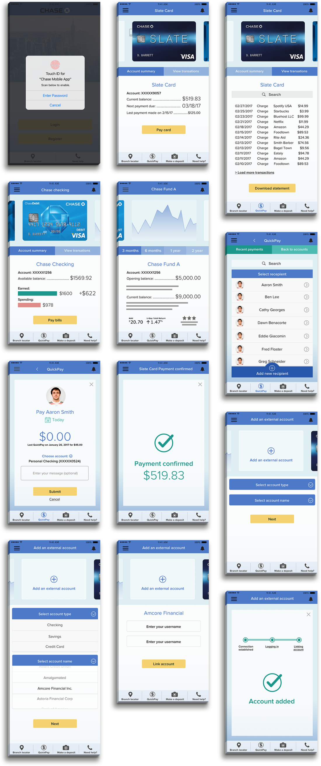
Proposal to provide users a better banking experience by optimizing access to core features like making deposits, paying bills, checking and paying credit card balances, and using QuickPay.
Proposal to provide users a better banking experience by optimizing access to core features like making deposits, paying bills, checking and paying credit card balances, and using QuickPay.
Proposal to provide users a better banking experience by optimizing access to core features like making deposits, paying bills, checking and paying credit card balances, and using QuickPay.
Chase mobile app to perform a good deal of banking on the go. I thought there were some opportunities to make the app more user-friendly and efficient.
After I performed a content inventory of the existing app, I felt that the areas where the site could be improved were:
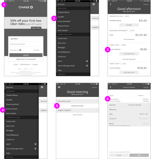
While this content organization seemed the most logical I felt this didn’t solve the problem of being able to switch quickly between accounts. It also lacked visual cues to allow a user to quickly differentiate between accounts. After doing some research, I was inspired to look for a more engaging solution. Swiping has been proven to be the fastest method for interaction and engagement on a mobile device. What if we could allow the user to quickly swipe between accounts with a visual prompt like an image of their bank or credit card? I pivoted and began to change my wires based on this.
Selected Works
LUXTURNA MLMT VRUX/UI

Game of ThronesDesign
C5 Exhaustion HotelDesign
Neffy BrandingBranding
Athymia AnswersBranding
Atomic Sound BrandingBranding
The WaverlyBranding
DDB Health Holiday CardDesign
ARS Creative PositioningDesign
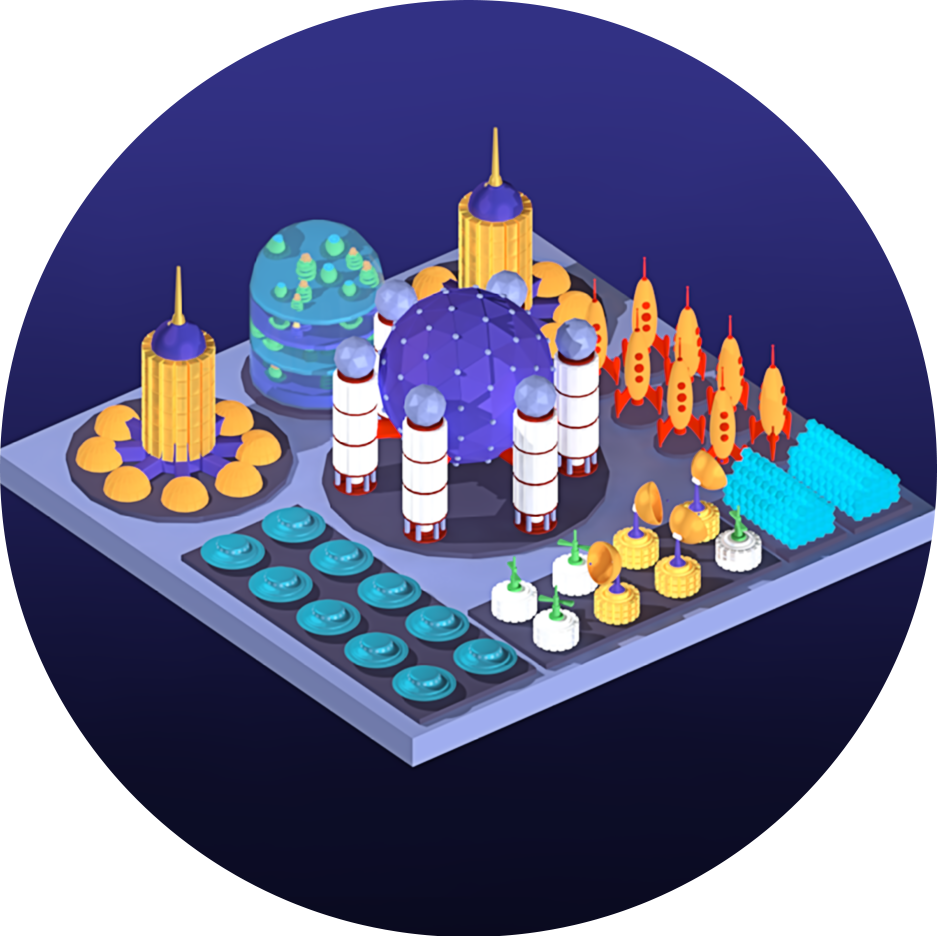
Isometric Space StationDesign

VHL Disease SiteDesign

LUXTURNA HCP SiteUX/UI
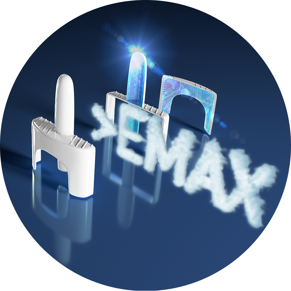
Leukine iVAUX/UI
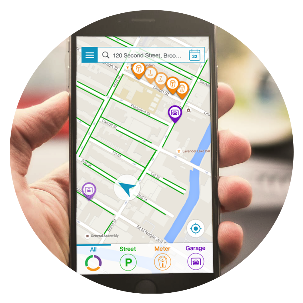
CurbyUX/UI
"You'll never soar like an eagle if you hang out with turkeys"
-Overheard from the streets of Bay Ridge
© RPTR 2021 | REPDESIGN LLC